Eccord
- Logo
- Naming
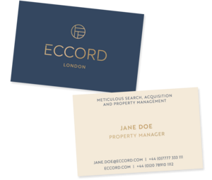
- Brand identity
- Brand guidelines
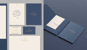
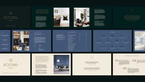
- Print collateral
- Website design & development
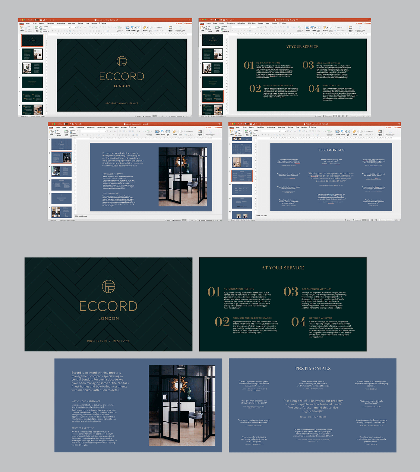
- Powerpoint templates
- Brand strategy
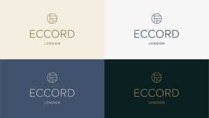
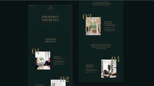
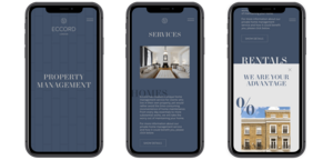
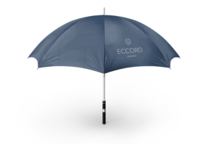
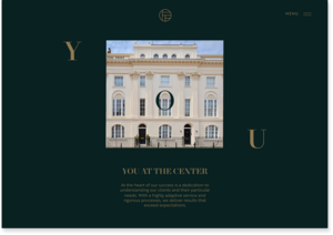
Eccord (formerly SP Property Group) is a high-end property acquisition and management business who approached us for a full rebrand and new website that better reflected their values and made them more desirable to potential clients.
From our brand workshops we discovered that what sets Eccord apart from their competitors is a genuine passion and pride for their service. They are determined in their efforts and confident in their impressive results.
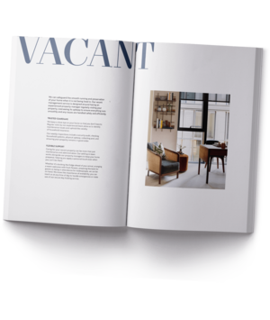
We devised a rich, type-led identity with the maxim of ‘results without compromise, service with passion’ to better portray them as a meticulous, experienced and aspirational business that is also accommodating and honest. Our successful rebrand has led to considerable growth for their business.
- Logo
- Naming
- Brand identity
- Brand guidelines
- Print collateral
- Website design & development
- Powerpoint templates
- Brand strategy